NetVendor platform is a SaaS application that centralizes and automates all aspects of vendor compliance data including collecting, verifying and maintaining a repository of all insurance certificates and documents. It can be integrated with leading property management systems such as MRI, ResMan, Yardi, Entrata, AMSI, RentManager, and appfolio.
A wide range of features such as:
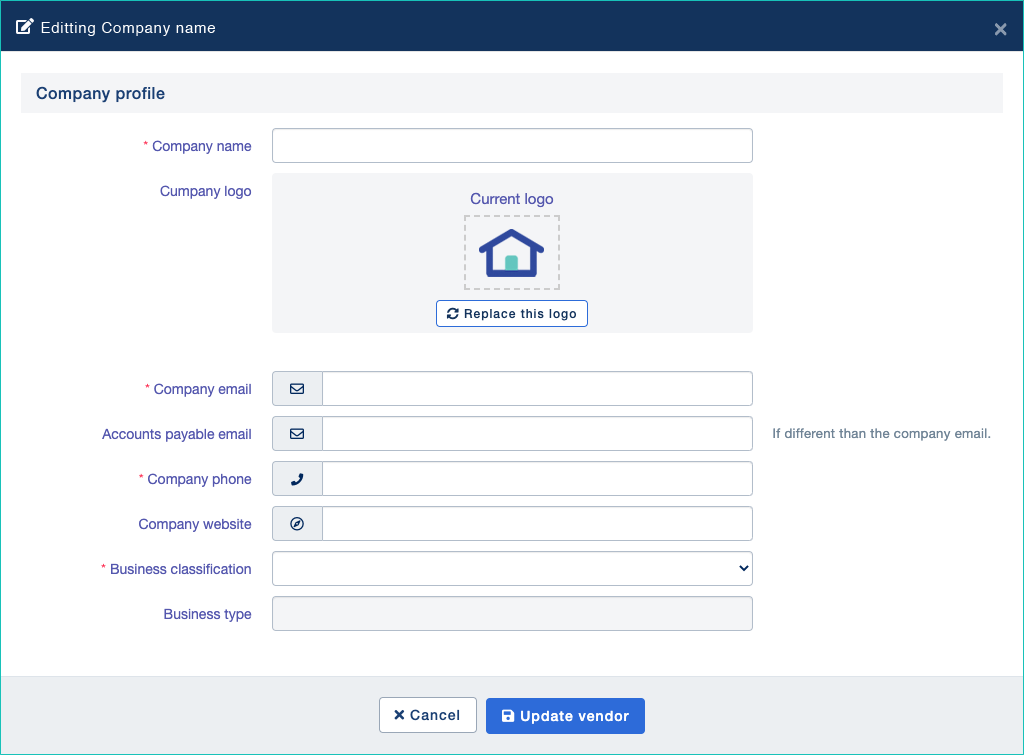
There are multiple user roles in different backgrounds who can interact with the platform such as vendor, property manager, customer support team and system administrator. Each role of the user has different permission levels to access the platform so the application contains a lot of user interfaces. It was a challenging task to redesign and implement all of the user interfaces without interfering or introducing new issues on the existing integrations that were still in use.
Note: A limited amount of work is shown due to the sensitive information.
First, we tried to identify where the areas of weaknesses of the platform were. Then we evaluated the feedback from our users and asked questions to get a better understanding so we could identify, prioritize, and make any suitable adjustments. We also let users suggest new features and kept the communication pipeline open throughout the redesign process. I was responsible for redesigning all user interfaces and assisting the engineering team in implementing the layouts without compromising the functionality for aesthetics.
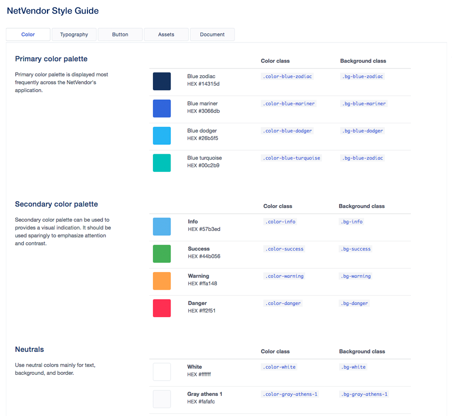
To increase the efficiency of our team’s workflow, I started documenting the style guide and design system throughout the redesigning process.
Once these frameworks and patterns were developed and established, our team collaboration was improved. Multiple contributors can maintain consistent user interfaces and build a maintainable platform moving forward. Designing with consistency in mind helped develop trust and comfort for our users and made the whole experience more fluid.
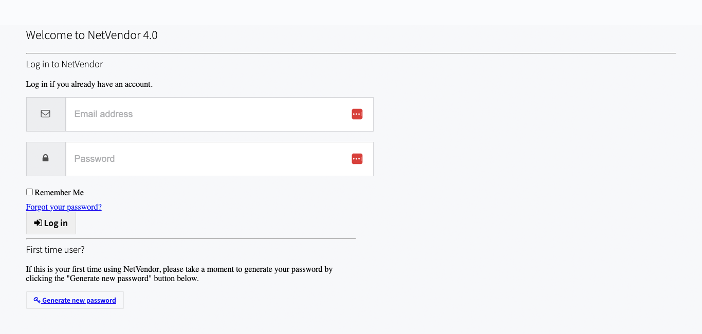
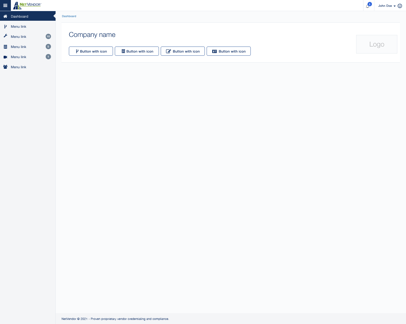
We started redesign and implemented the simple page layouts first such as the login page. We kept it simple and straightforward by removing unnecessary UI elements.
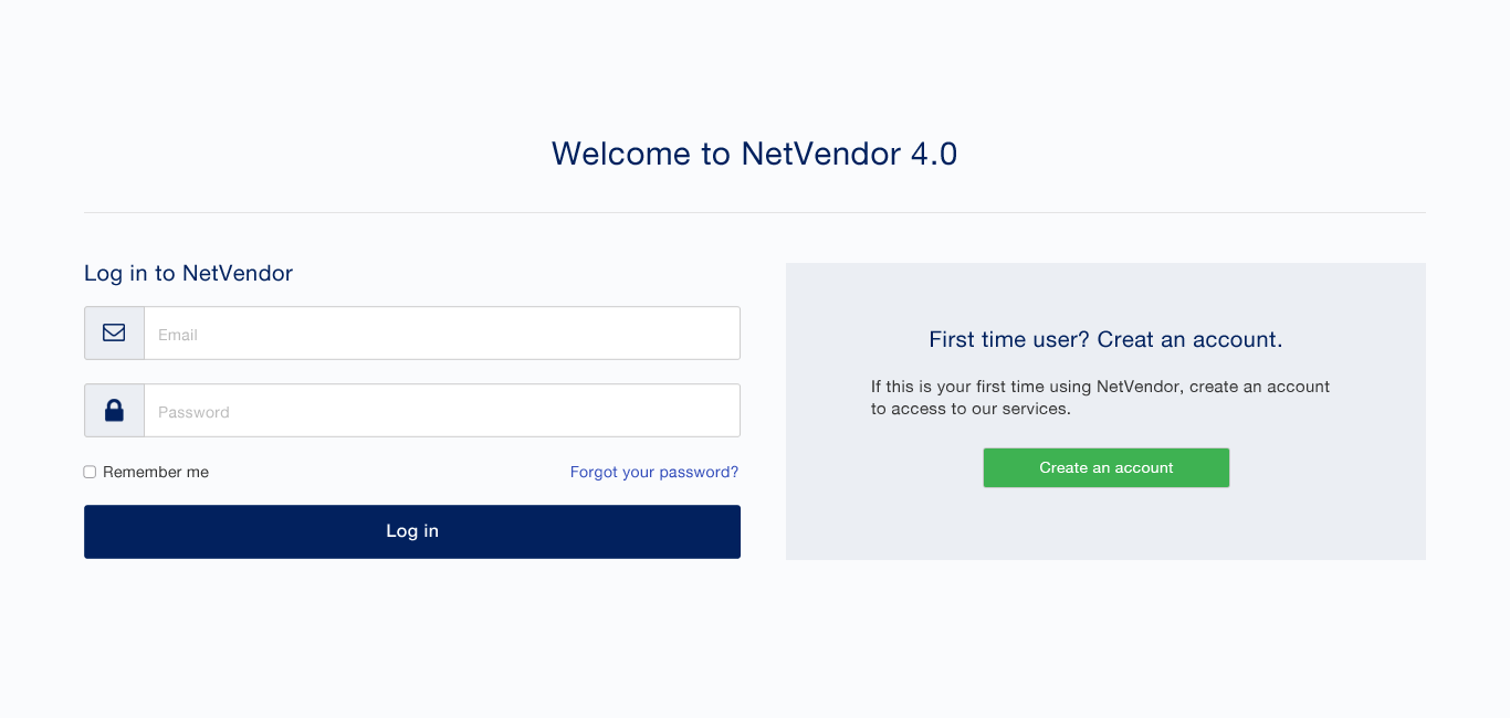
To provide seamless user experience, we kept the overall layout and navigation structure while improving the color scheme, typography, and iconography. We also slowly incorporated new design elements and removed unnecessary components so the users can easily adjust to the new design.
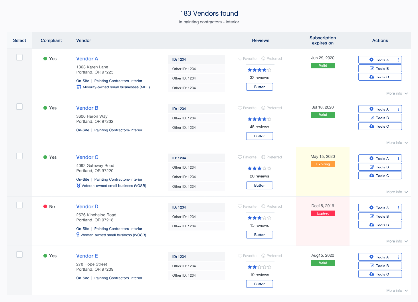
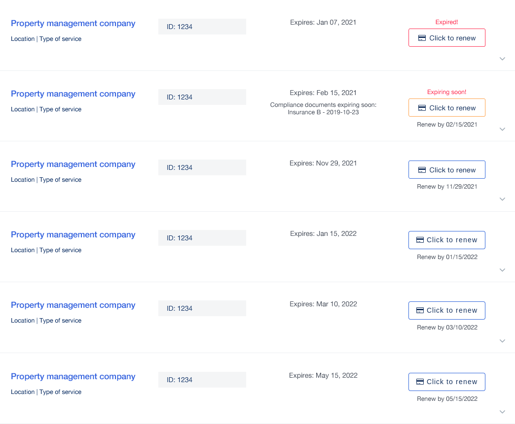
The search function was one of the indispensable parts of the NetVendor platform. It was a central tool for the property managers and customer support teams to find vendors from a large database. To provide a positive search experience, we placed the most used filters instantly visible at the top and hid the additional filters for users who want to refine and narrow down their search for specific criteria. This approach helped users worry less about details that are not needed and reduced unnecessary clutter UI.
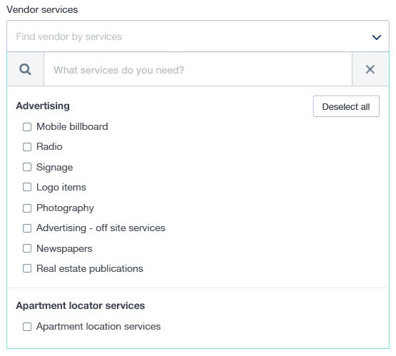
Since we had a long list of the vendor services, it was painful for users to scroll through and look for specific services. To increase search efficiency, we changed a select dropdown to search input box with multi-select options dropdown capability. Users can define their search parameters by typing in the name of the service to get to the relevant part of the list and select multiple services at the same time.
We logically categorized vendor services and presented them with bold titles. This visual hierarchy helped users scan through the list quickly. Especially when it comes to unfamiliar services, users can visually expose the list and look to find what is relevant.
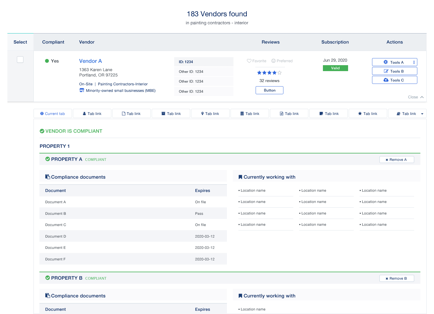
The vendor's search result was displayed in tables format with expandable rows. Using tables allowed the information to be presented in a grid-like fashion but there were some limitations using tables. Incorrect use of tables can lead to responsiveness challenge and rendering times issue.
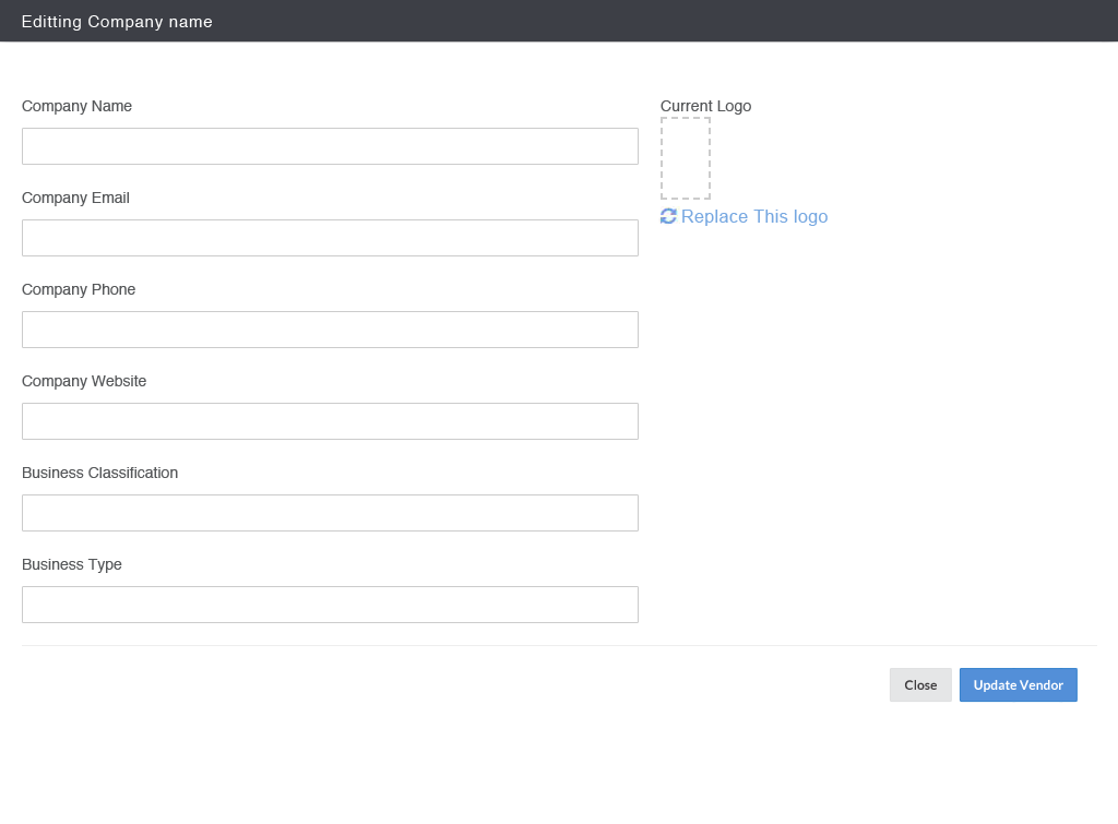
Using divs to present tabular data has become a standard practice because they are more adaptable. With the limited resources and time, we compromised by keeping only necessary tables and rearranged the key relevant information in an easily scannable format. We removed color distraction and applied new design elements to maintain the UI consistency throughout the platform.
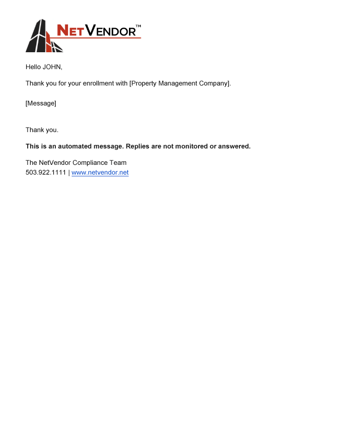
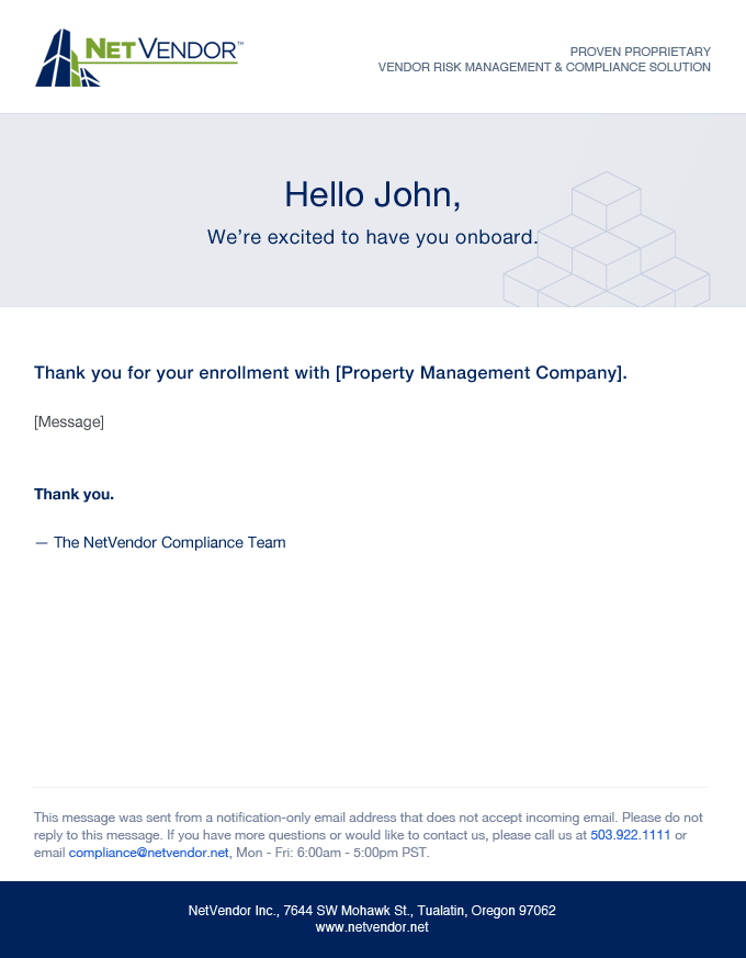
From the moment the vendors completed the enrollment process on the vendor enrollment website, an immediate confirmation email was sent to reassure that their onboarding was secured. The previous email design had a text-heavy message with a minimal formatting template in place. To deliver a personalized onboarding experience, I redesigned and helped implement a rich text email template. With the new template design, we were able to send more aesthetically appealing messages and gave users a more visually engaging experience with the NetVender brand.
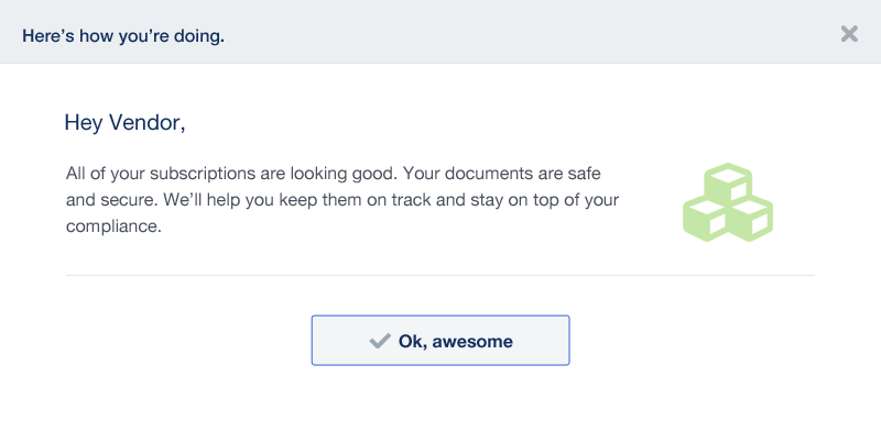
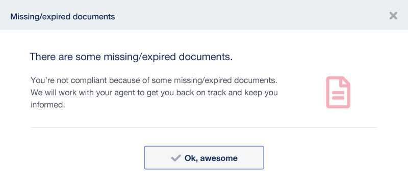
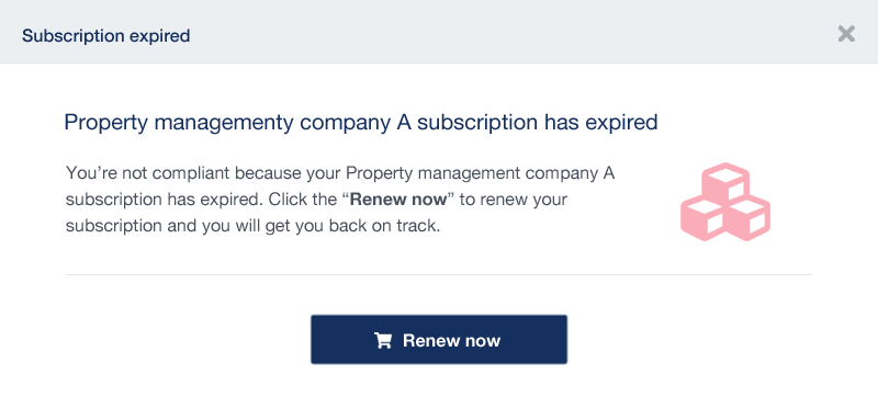
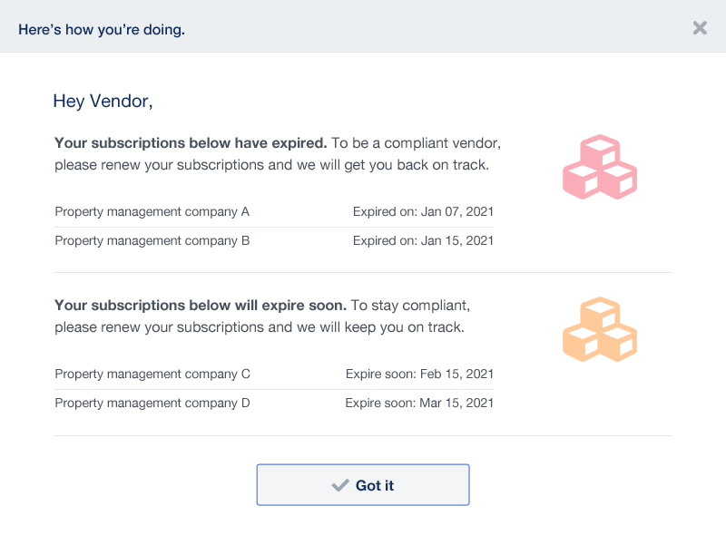
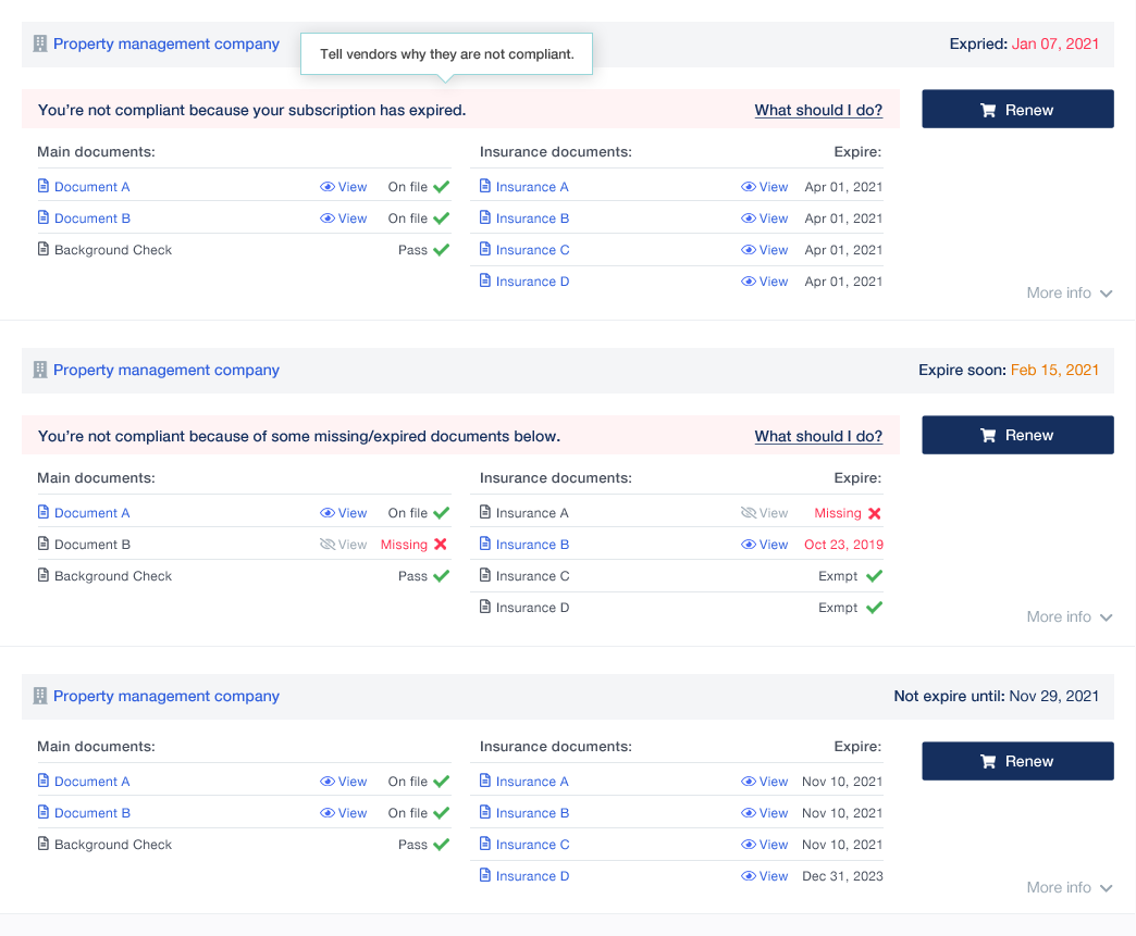
The vendor dashboard page was the second point of contact for vendors after they passed the enrollment process. On the dashboard page, there were clear elements indicating the non-compliant status of vendor’s subscriptions but there was no explanation why. The question, “why am I not compliant?”, was one of the most-asked questions during the customer support calls.
When vendors noticed that they were non-compliant because of missing or expiring documents, they tried to look for a way to upload these documents to the platform themself. There was no clear message telling vendors that the compliance team will work on their behalf and talk to their insurance agent to obtain the right documents. This led to another call with the customer support.
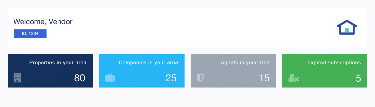
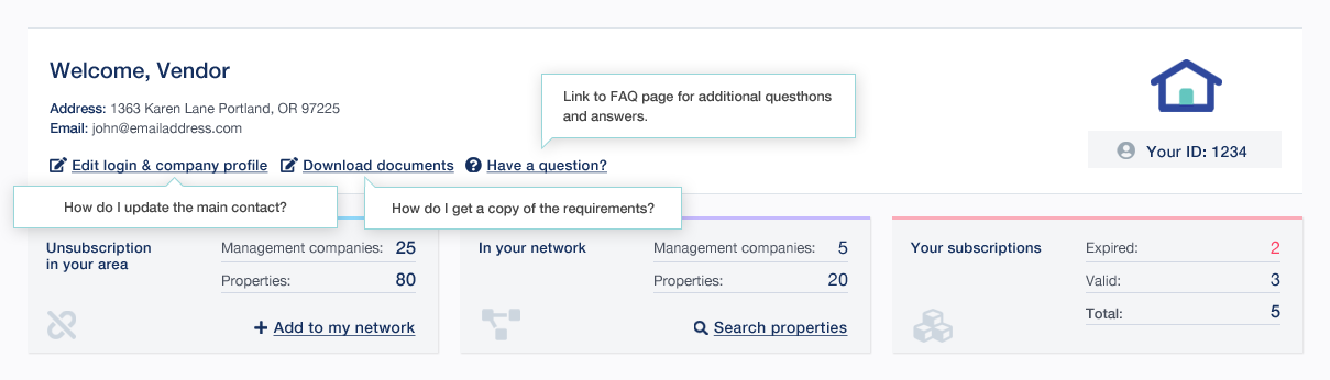
There were other repeated questions from vendors that the customer support teams received frequently. The teams put together the top list of these questions and some other UI changes suggestions.
After reviewing customer support teams requests, I designed a new vendor dashboard UI with possible popup notifications to inform vendors of the important messages. The customer support and engineering teams had positive feedback and thought these would be a good starting point to reduce incoming customer support calls from vendors.
In addition to the new vendor dashboard redesign, I created a new FAQ page mockup to display the repetitive questions from vendors and categorized them by informative topics. Our goal was to provide an effective experience, allow vendors to find answers to their own questions, and free customer support’s time for more urgent issues.