Improving design and front-end implementation of an online vendors enrollment website

NetVendor

Project

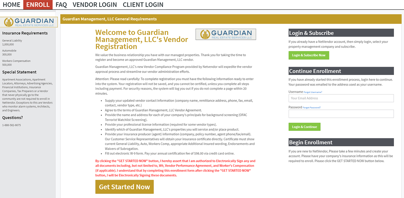
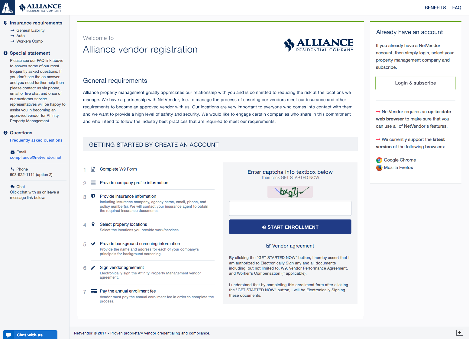
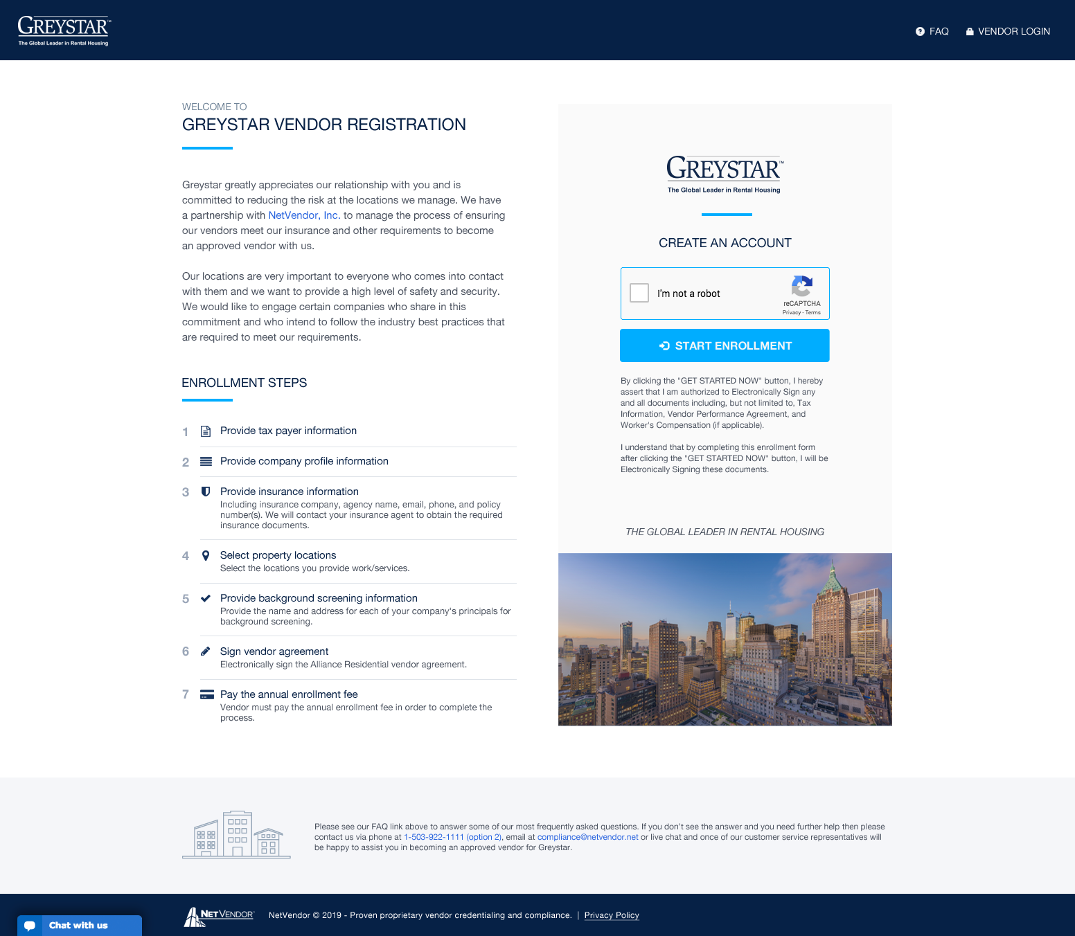
NetVendor partners with the property management companies and helps them manage their vendor credentialing. All vendors are required to enroll and pay subscription fees online to ensure they meet the insurance, background screening and other requirements. The 7 enrollment steps is the first point of contact between vendors and NetVendor platform.

Since the vendor onboarding process required a lot of data collection upfront, NetVendor team strategy was to present the required information on the vendor enrollment welcome page to notify vendors of what they had to provide during the enrollment steps ahead. This overwhelming information discouraged some vendors causing them to abandon the enrollment process in frustration and resulting in high call volume for the customer support team to advise vendors during the onboarding process.

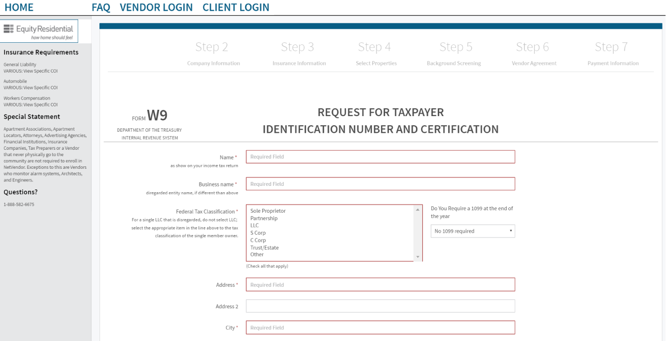
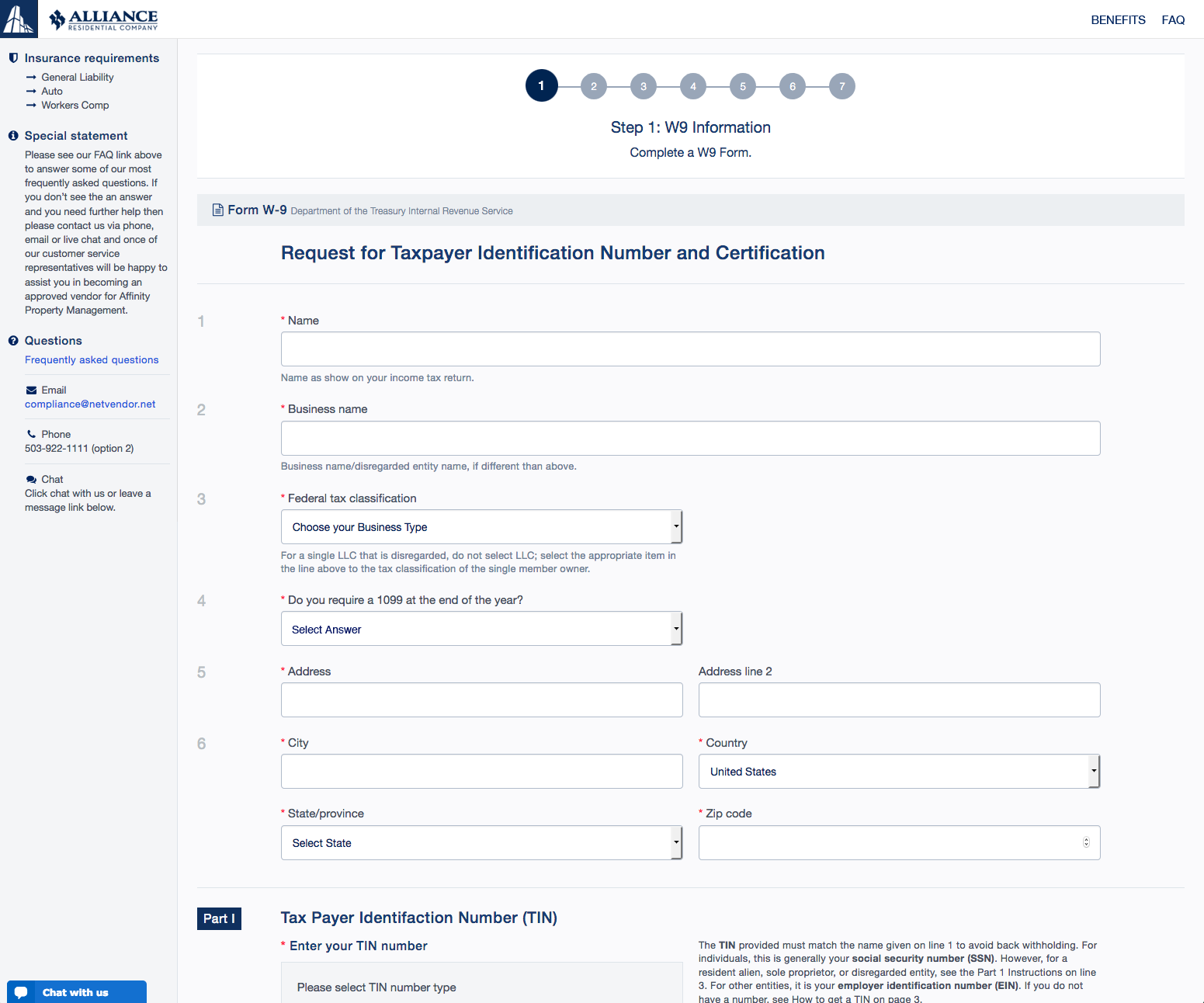
Note: A limited amount of work is shown due to the sensitive information.

Involment
UI design
Front-end code
Client

NetVendor

Date

2017 - 2019

A quick turnaround compromised solution

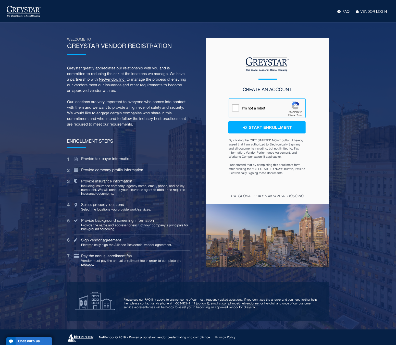
The NetVendor team was not ready to commit their resources to the full user interface redesign and preferred to keep most of the information on the enrollment welcome page. As a quick way to help vendors move forward and complete the registration process I thought we could use some visual hierarchy to prioritize and give some clarification to specific information on the enrollment welcome page and simplify the registration forms. During the quick turnaround process, I also helped implement the front-end coding using HTML, CSS, and JavaScript.

Enrollment welcome page

  • Clear 7 enrollment steps: Since the vendors had a long barrier to entry, we thought making a clear visual cue of the 7 enrollment steps would help minimize vendors frustration and reduce the support calls.
  • Less cluster navigation: We removed unnecessary navigation links and left only helpful ones for vendors who need questions answered before start enrollment.
  • Minimized colors distraction: The onboarding information, logo and colors on the enrollment welcome page can be customized for each property management company. We limited the colors usage to minimize the distraction.
  • Convenient live chat: To make it easy for vendors to get help, the engineering team implemented the live chat to provide a direct contact channel to NetVendor support teams. This helped improve the vendors satisfaction and experience which resulted in reducing the support calls.
NetVendor
Before improvement

NetVendor
After improvement (1st iteration)

Enrollment forms

  • New improved progress bar: The signup process was broken down into 7 short steps due to the amount of data needed to be collected. We updated the progress bar to give vendors some motivation to complete the enrollment process and helped create a positive experience when each step got completed.
  • Less cluster form layouts: We updated the form layouts and made them less cluttered to improve the usability and increase the completion rate.
  • Effective labels and instructions: We provided clear consistent labels and descriptive instructions to help vendors navigate with less friction and avoid confusion or errors.
  • Clear communication error messages: It’s impossible to prevent the vendors from making mistakes. We updated the error messages so they were brief and visually pronounced. Instead of telling the vendors that they did something wrong, the messages told the vendors how to fix the problem which helped limit the frustration.
NetVendor
Before improvement

NetVendor
After improvement

Room for improvement

  • Simplify layout: To make the onboarding process as simple and clear as possible, we removed the left and right columns to minimize the distraction away from the key “Start Enrollment” action button.
  • Customizable enrollment theme: We integrated the ability to customize background and image on the enrollment welcome page so it looked uniquely pleasing to each property management company.
  • Future improvement: The 7 enrollment steps were still a long barrier for vendors to overcome. To enhance the positive experience, we could save some of the secondary input fields to be put in after the registration was completed. This would not only make the barrier smaller, but also increase the efficiency of the completion rate.
NetVendor
NetVendor
Enrollment welcome pages (2nd iteration)